Commissioned to create a design for C-Water, an up-and-coming canned water company that sells desalinated ocean water. Because the brand is still in the early planning stages, my approach was to create a logo that was clean, simple, and adaptable and could be used as the foundation of the company's visual identity going forward.
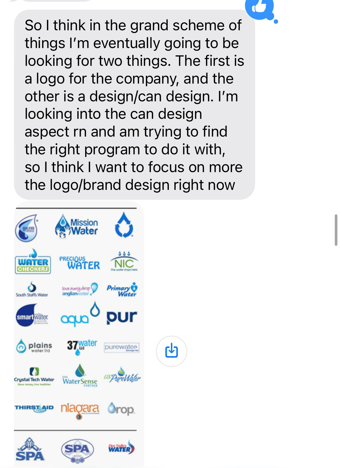
Below are the guidelines/ideas I was provided:
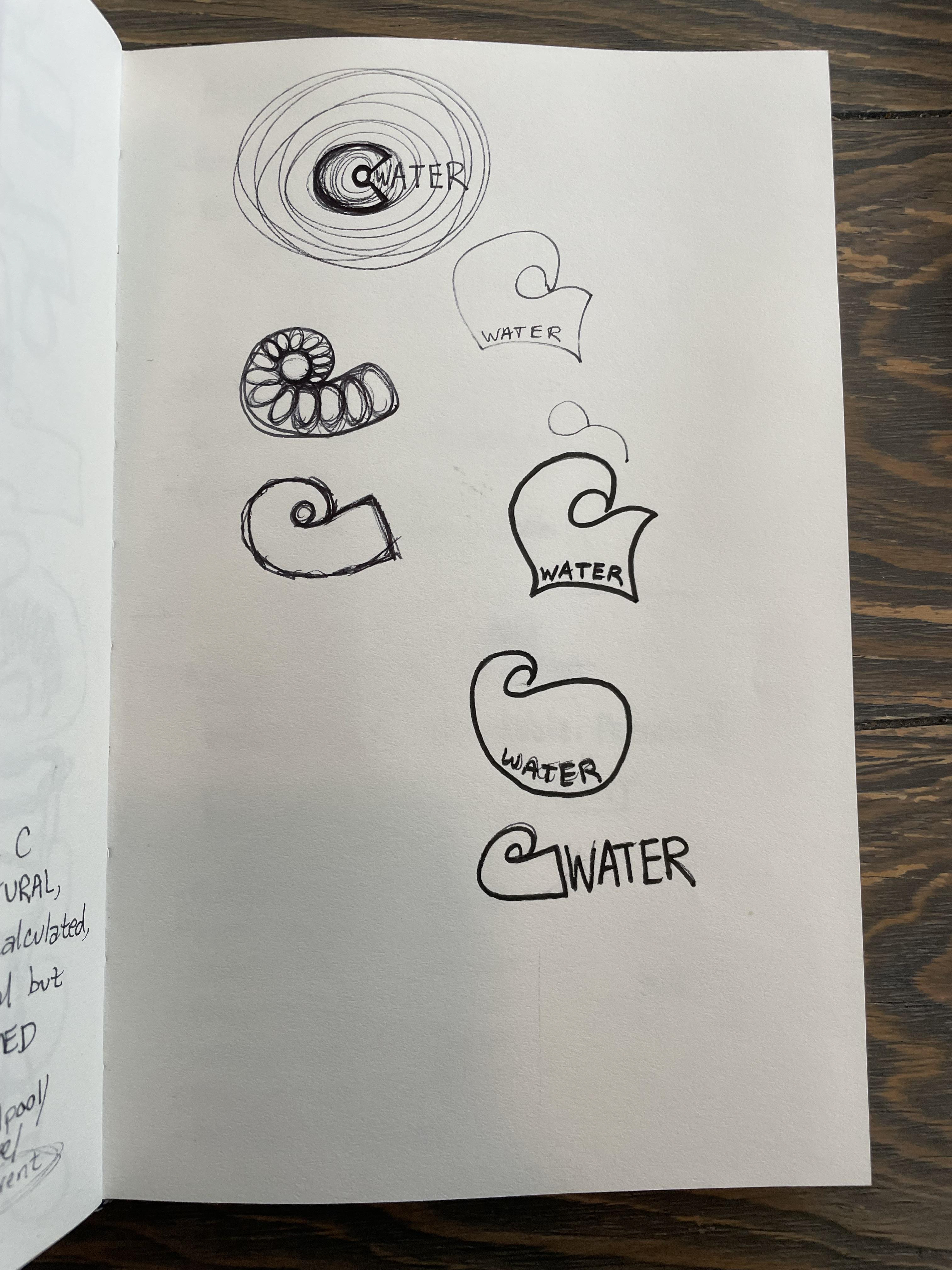
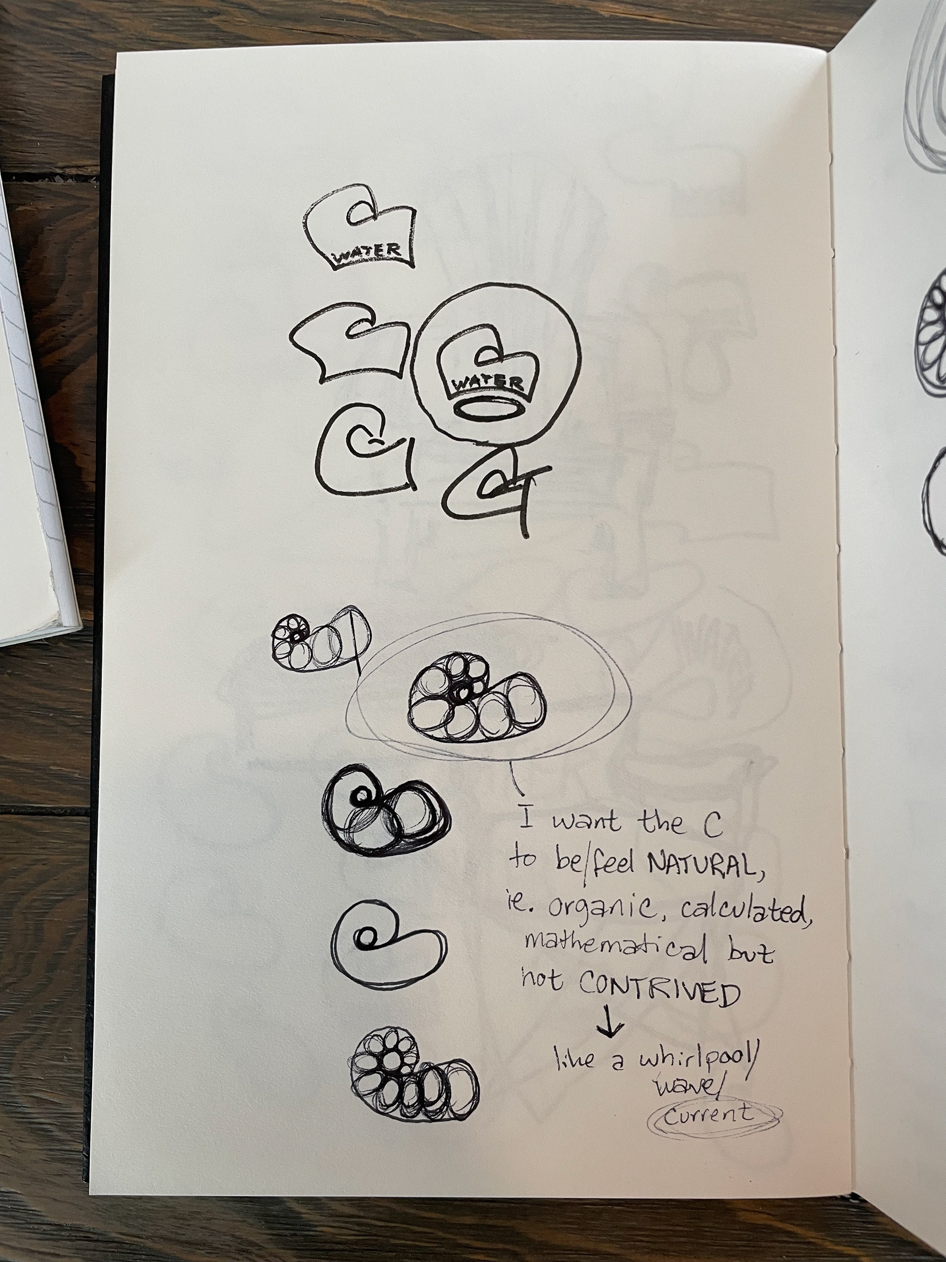
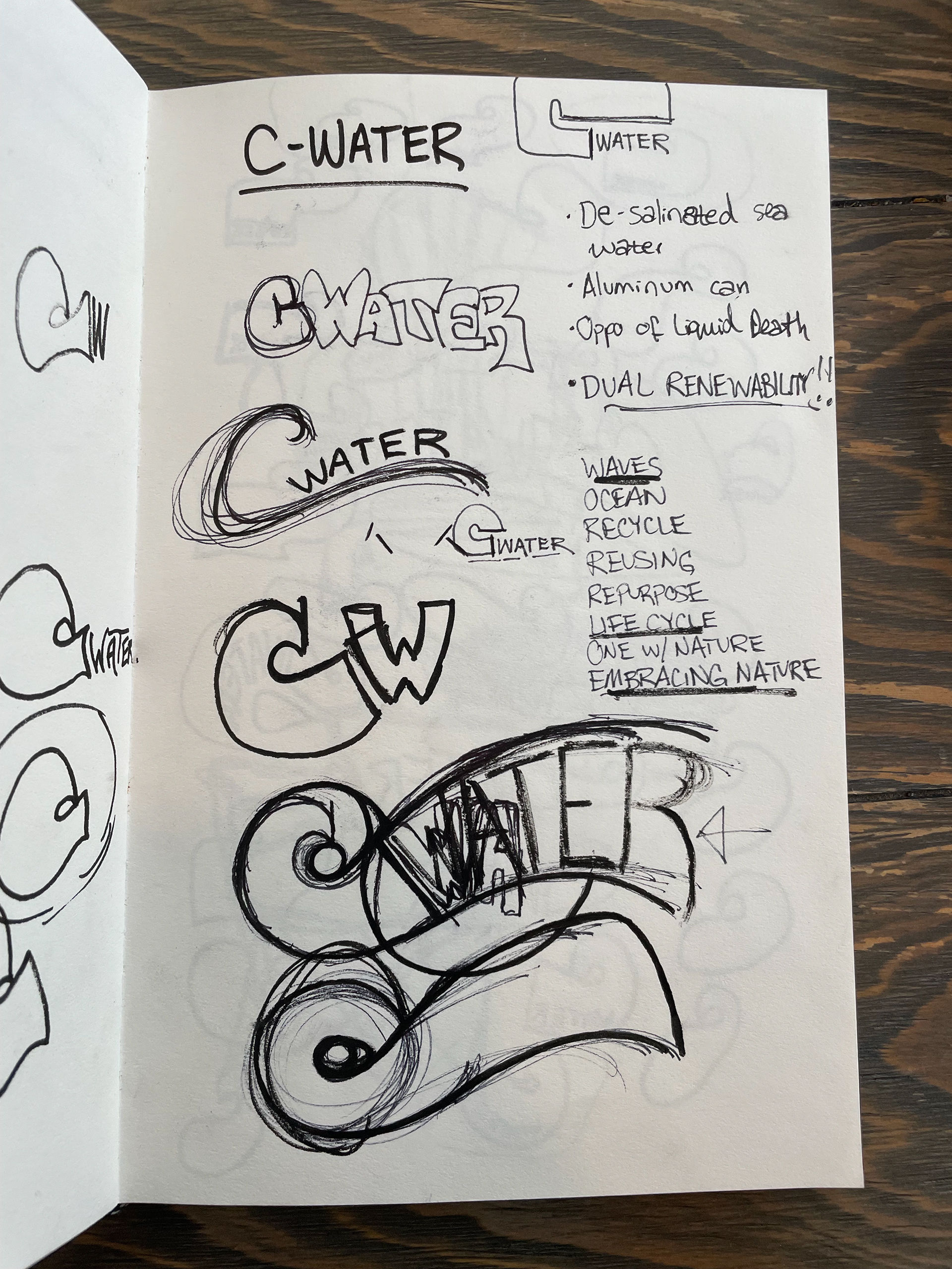
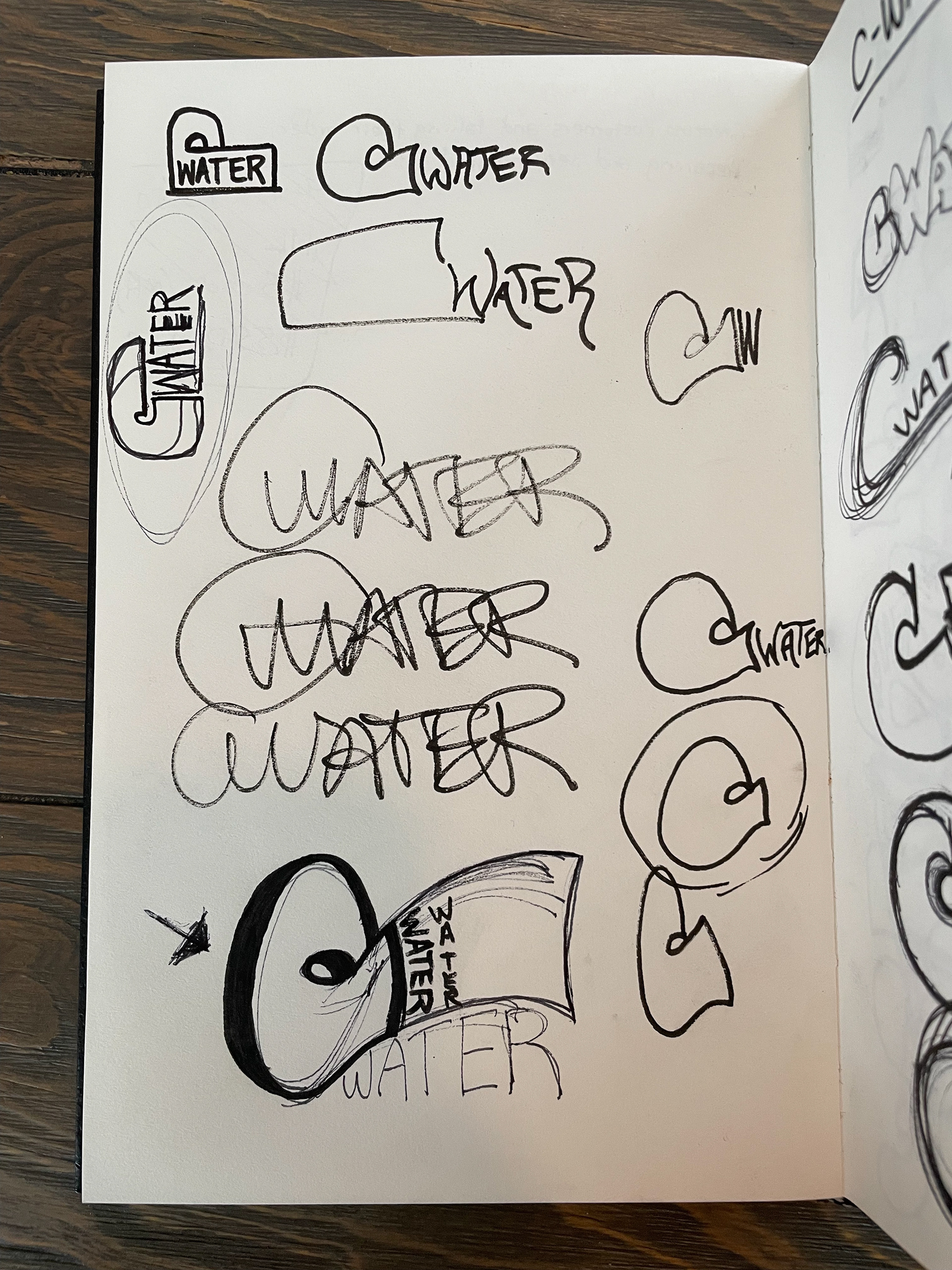
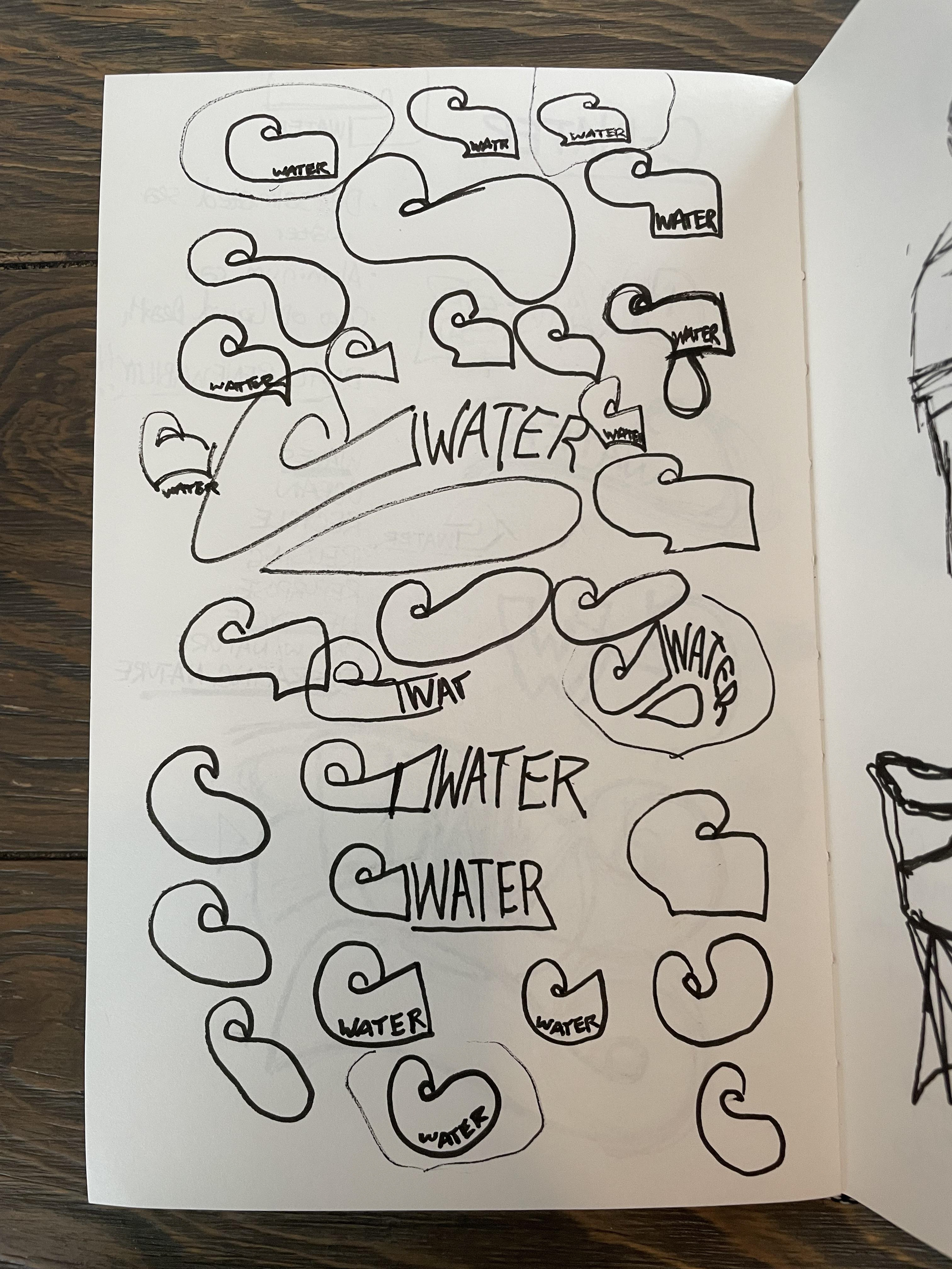
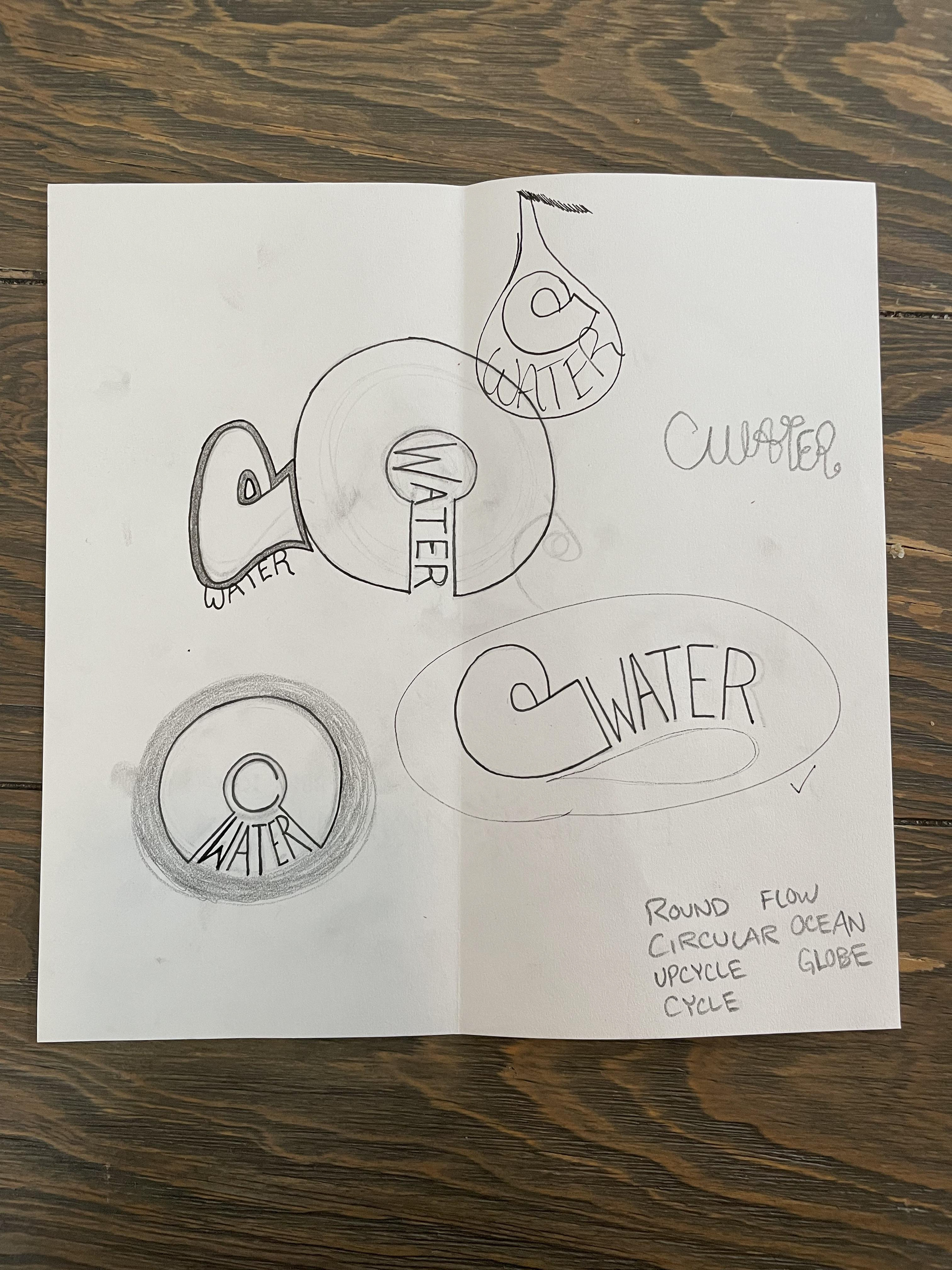
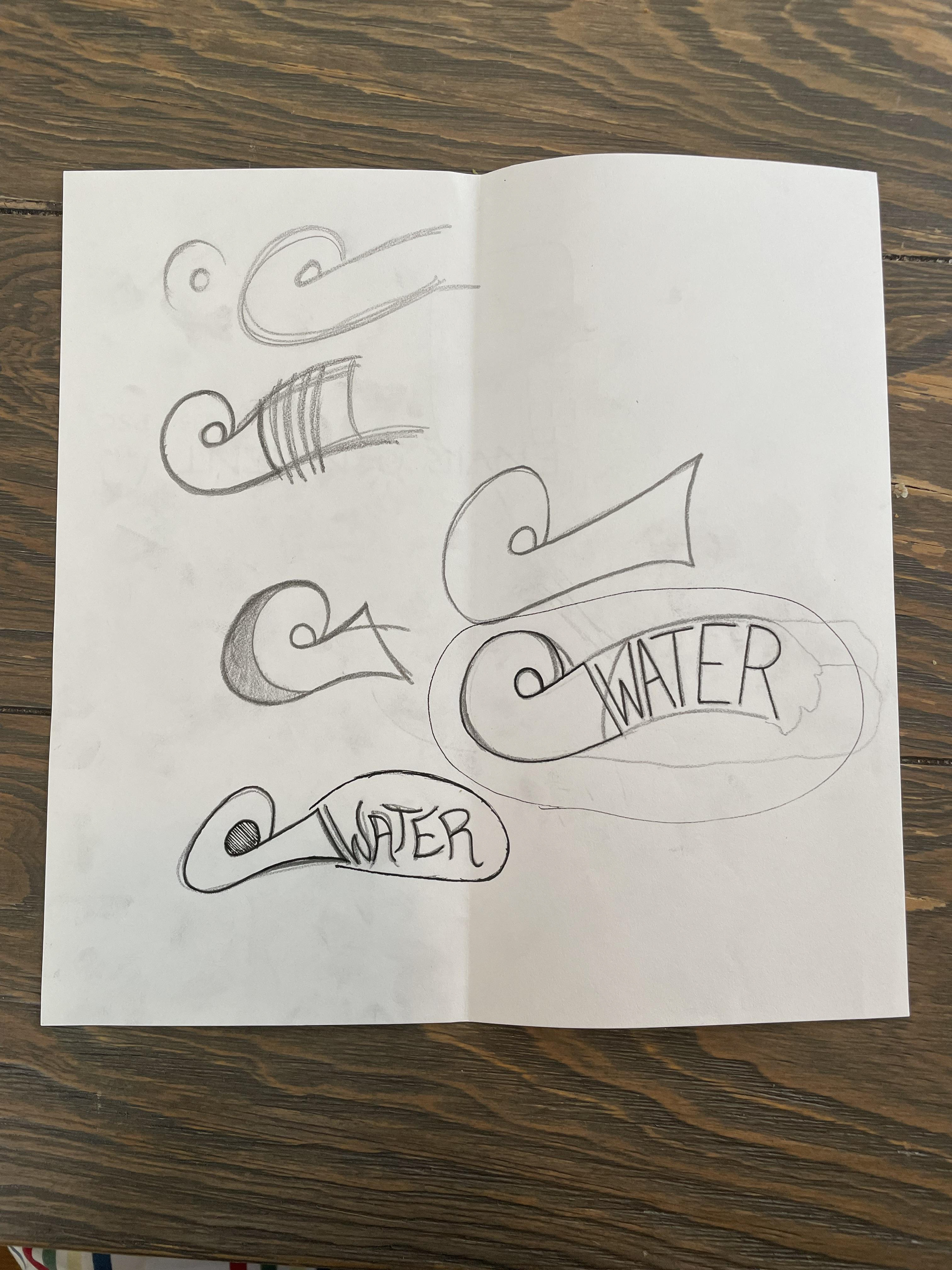
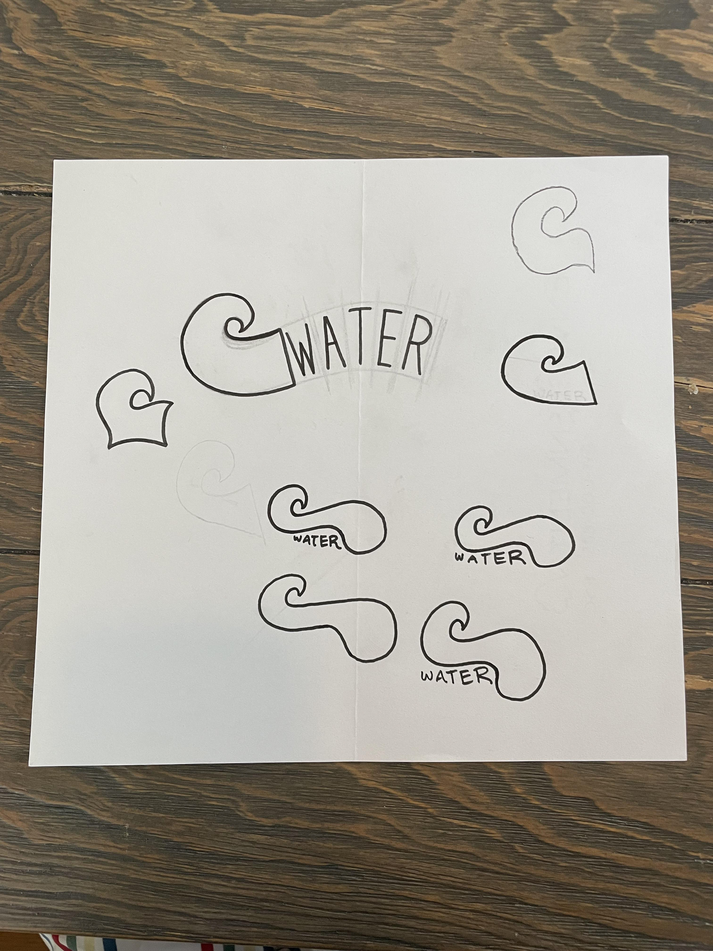
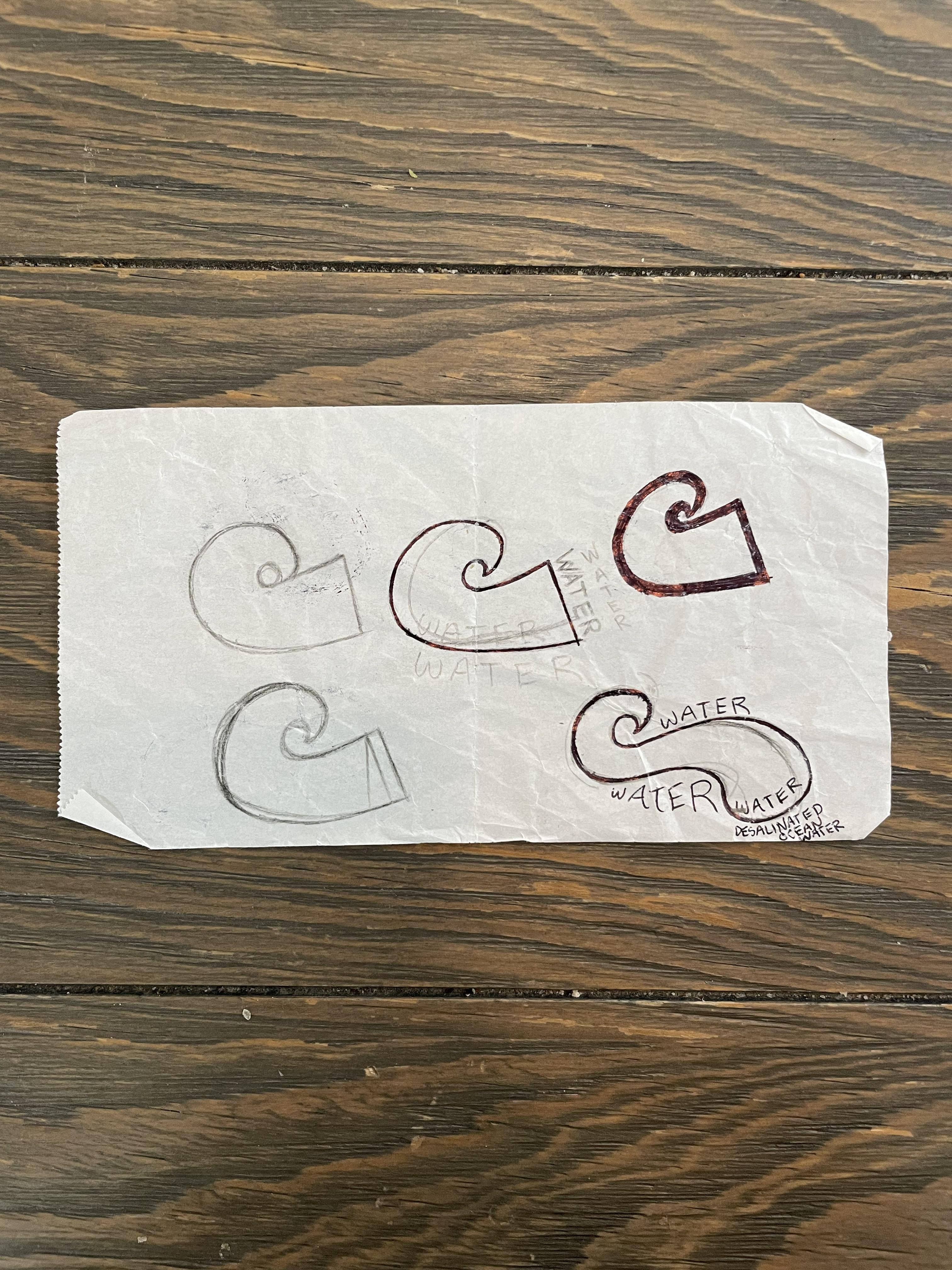
Preliminary sketches / brainstorming:
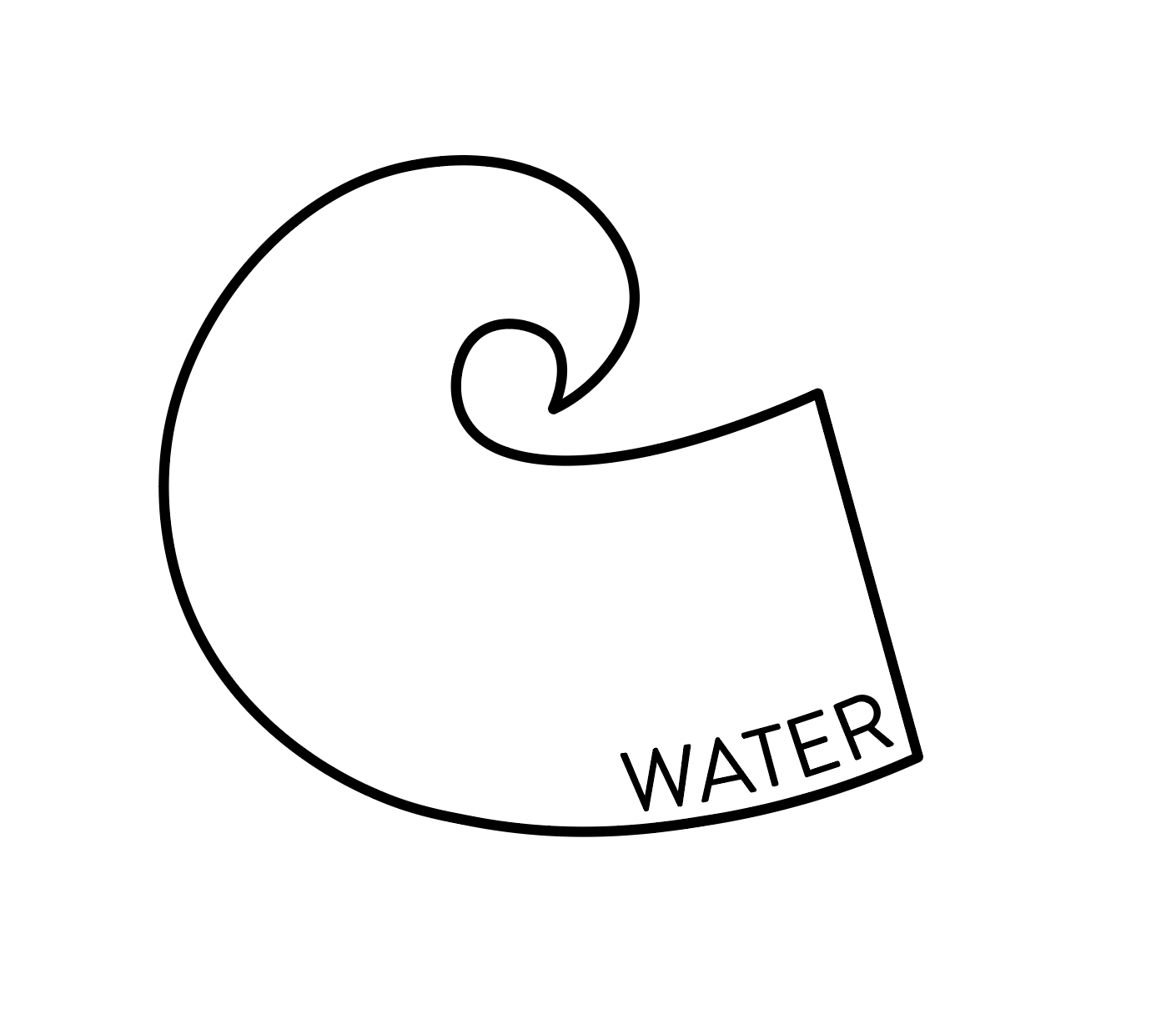
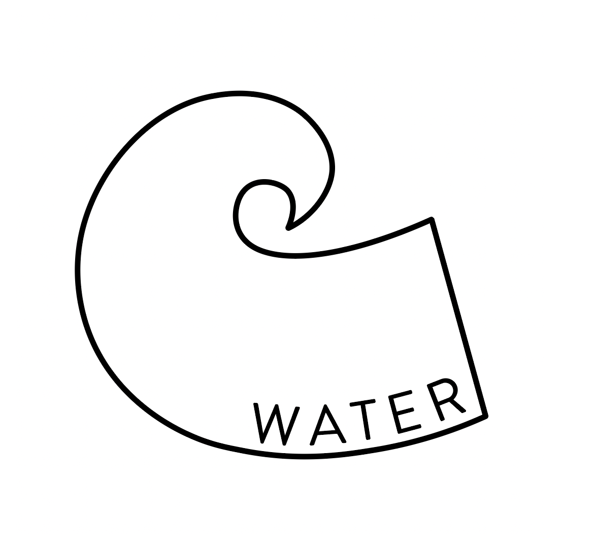
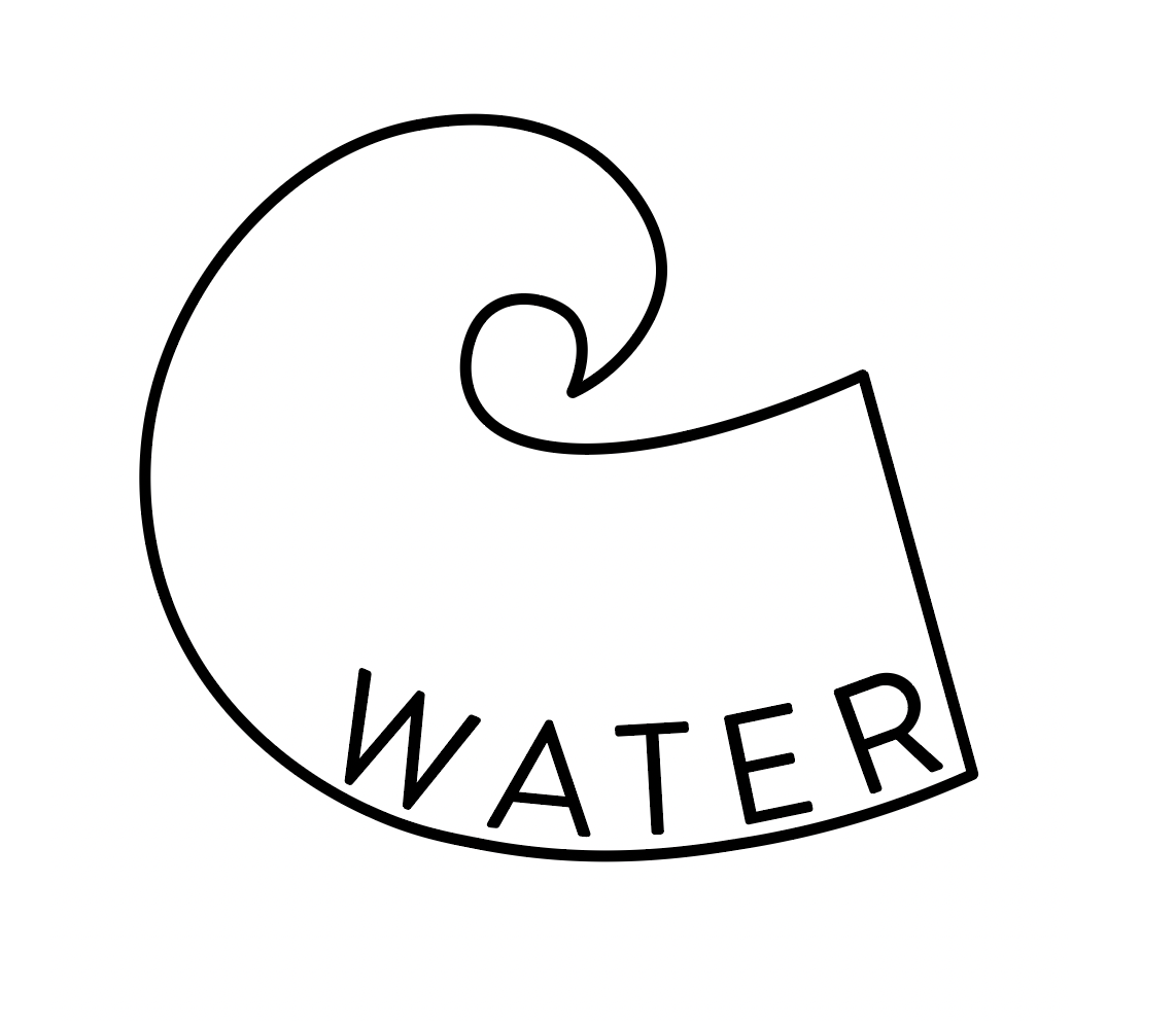
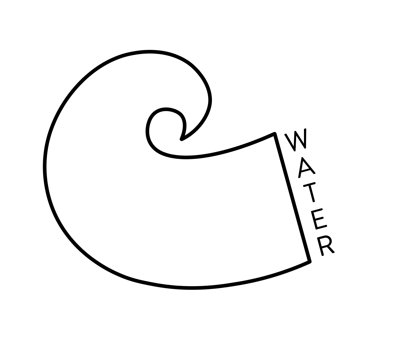
Initial digital renderings:
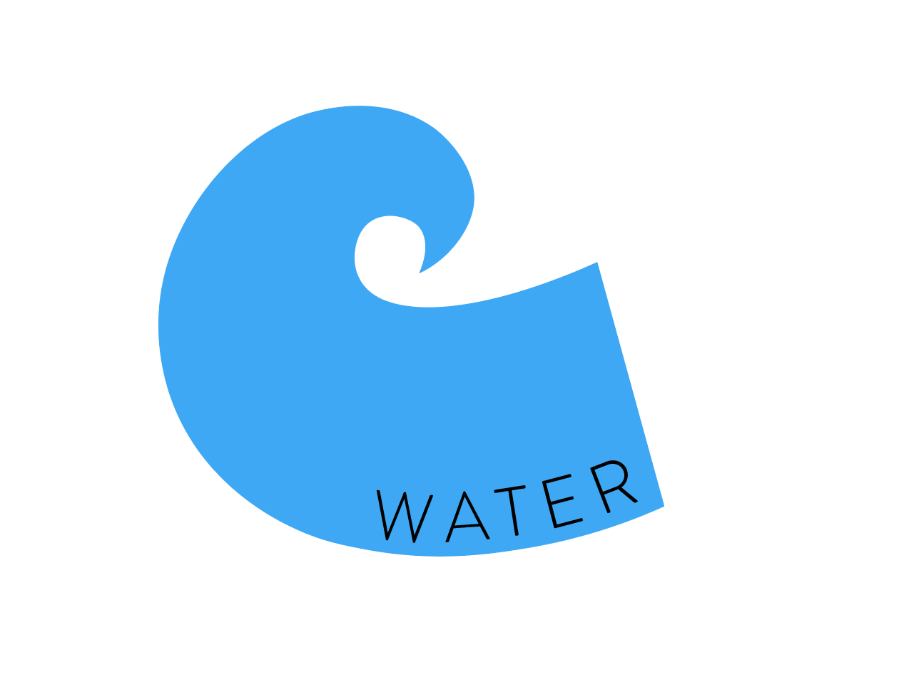
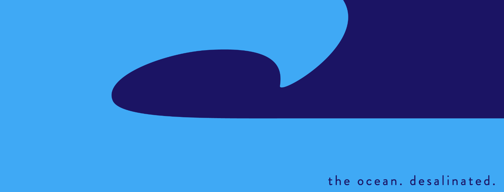
Revised digital renderings (with the addition of a navy blue raindrop):

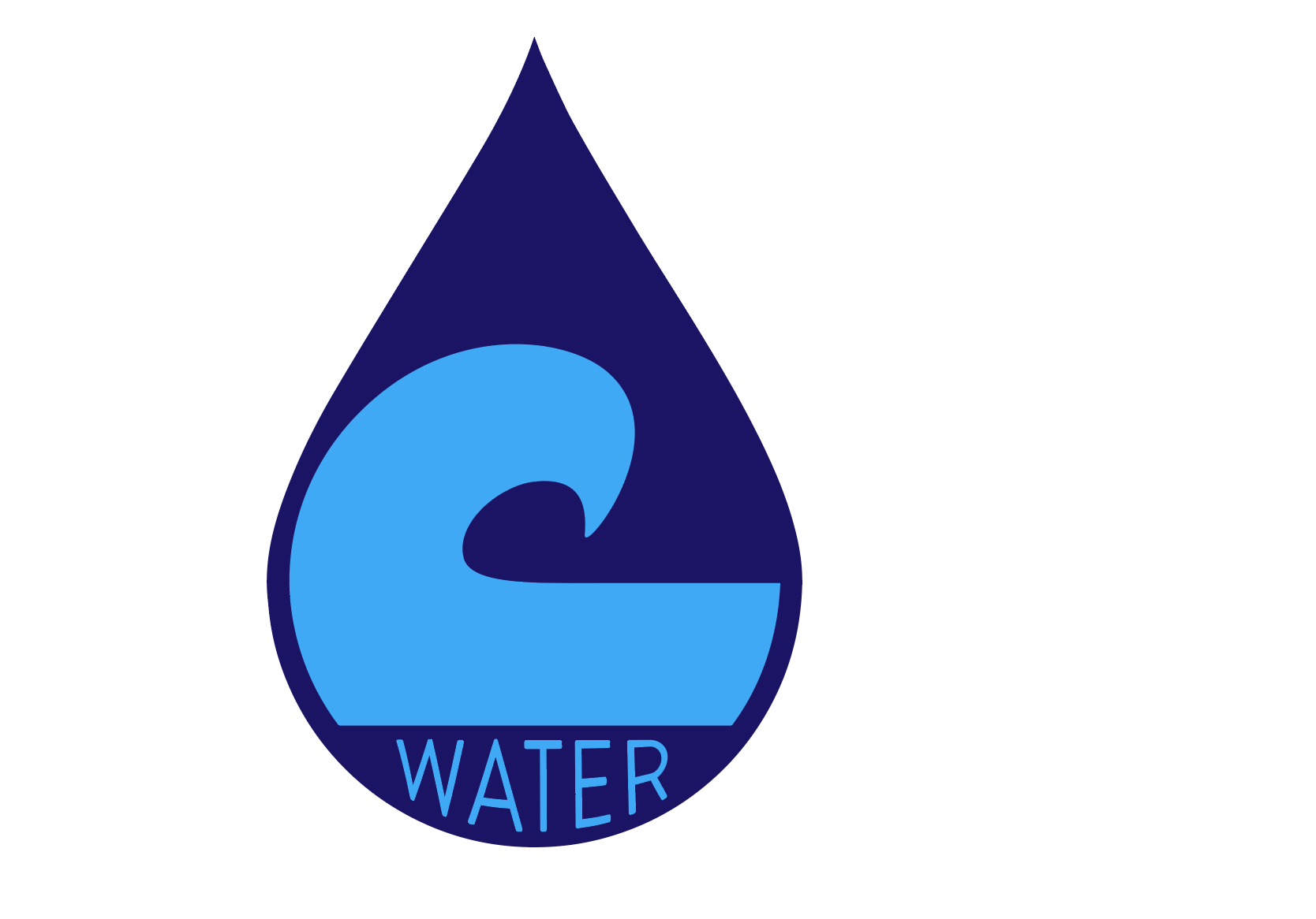
The addition of the raindrop made a huge difference to the overall feel of the design -- not only did it allow me to introduce a second color into the design, but it also provided a frame that the "C" could fit nicely into. My favorite designs are those that include distinct shapes, such as SmartWater, and I wanted to emulate that here. But something didn't feel quite right. Sure, it was nice to look at, but it didn't yet feel like a logo. Something needed to change.
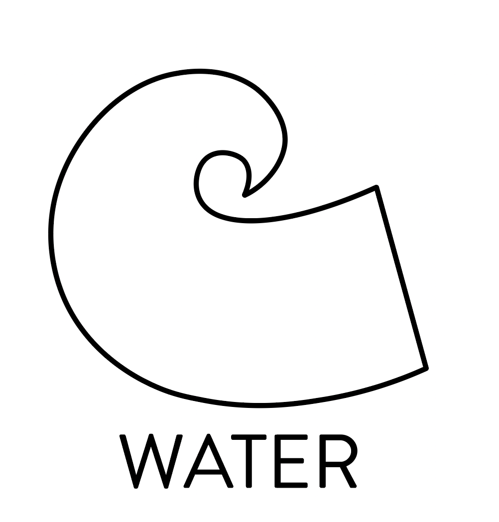
I played around with the orientation and interplay of the shapes, eventually landing on this icon:
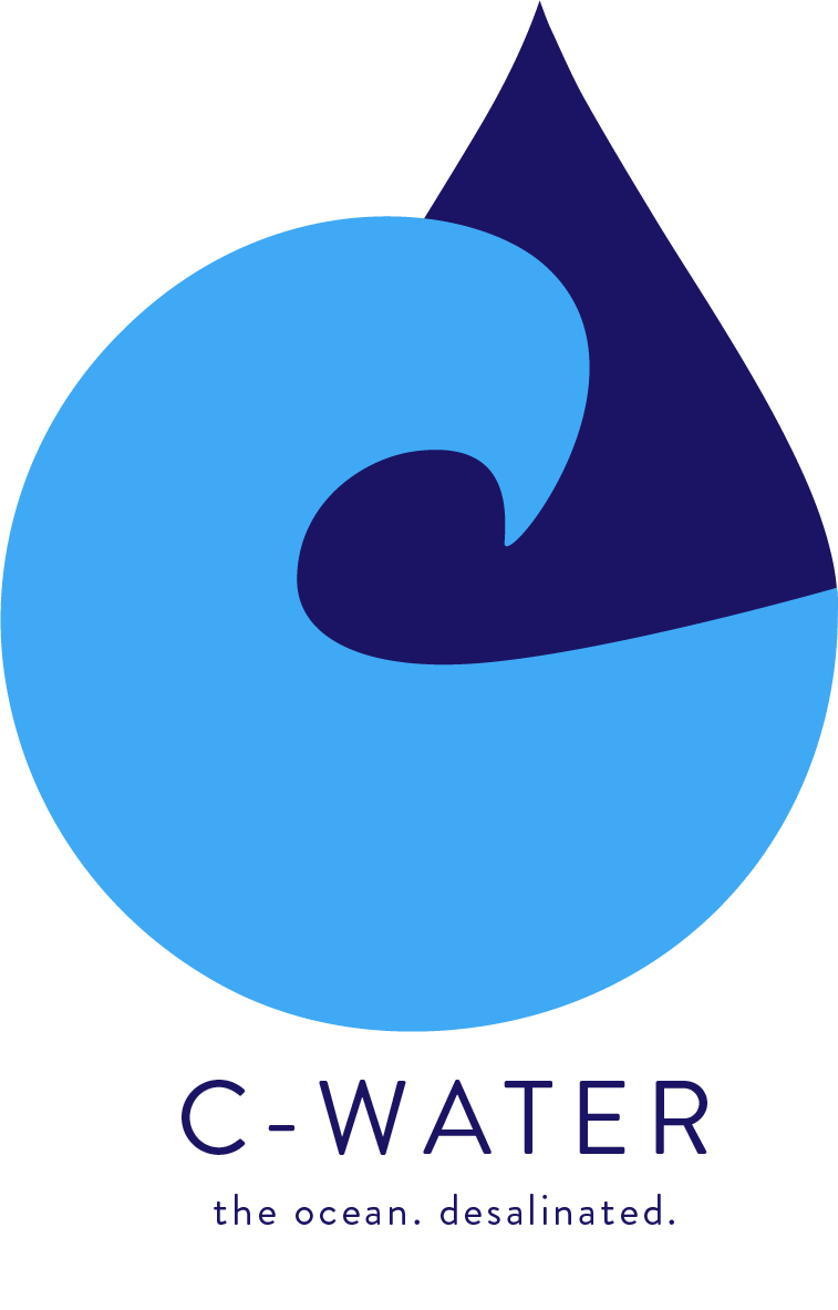
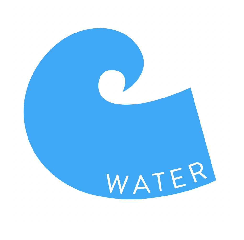
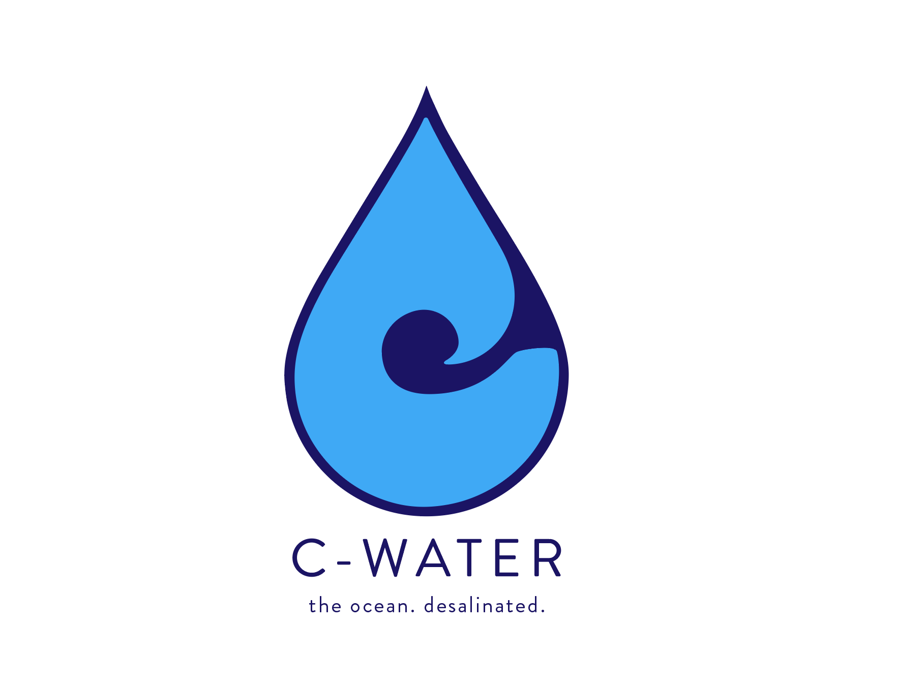
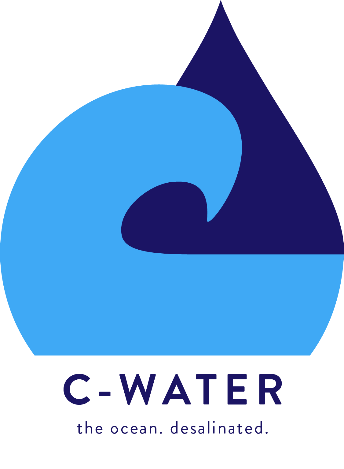
Now it felt like I was on the right track. I spent some time cleaning it up and making small changes that would make it easier to use across various platforms. The final design is below:
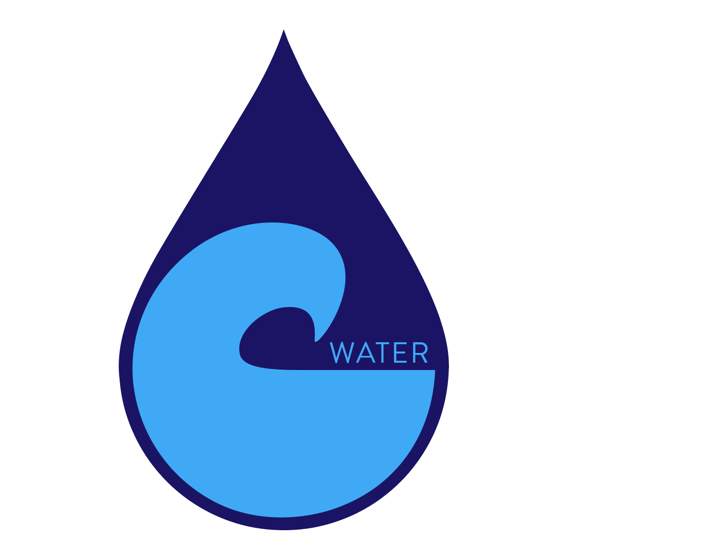
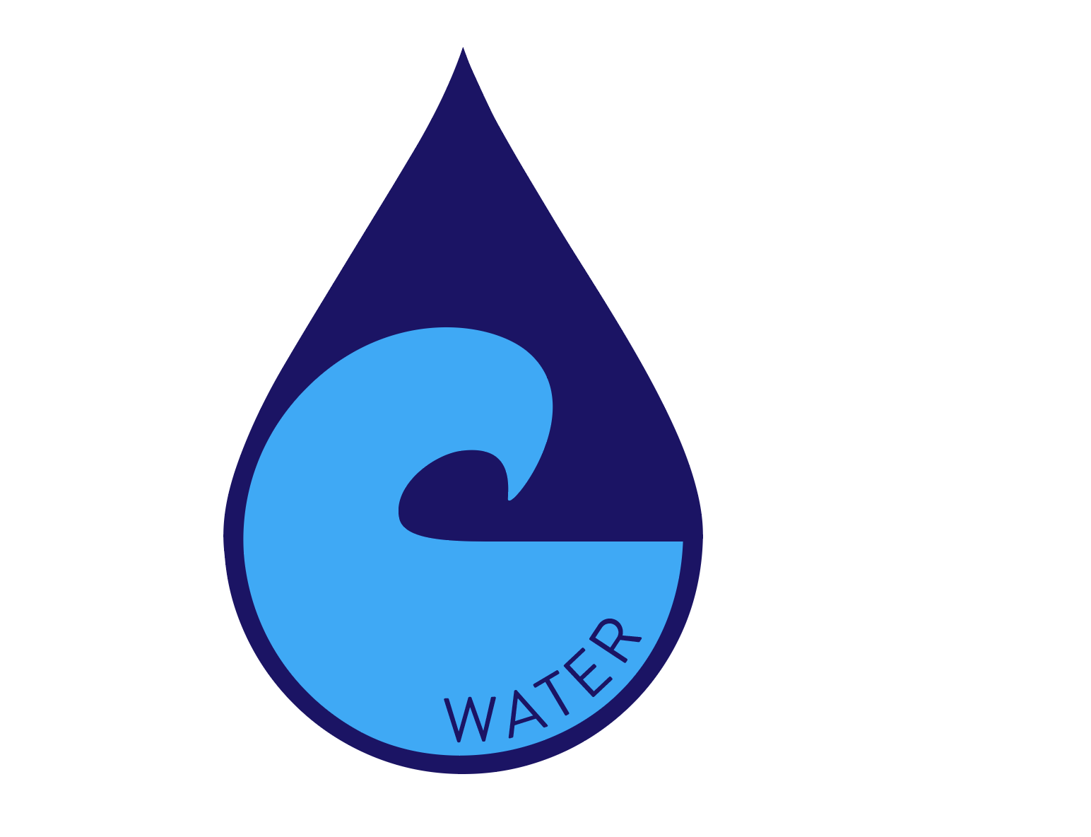
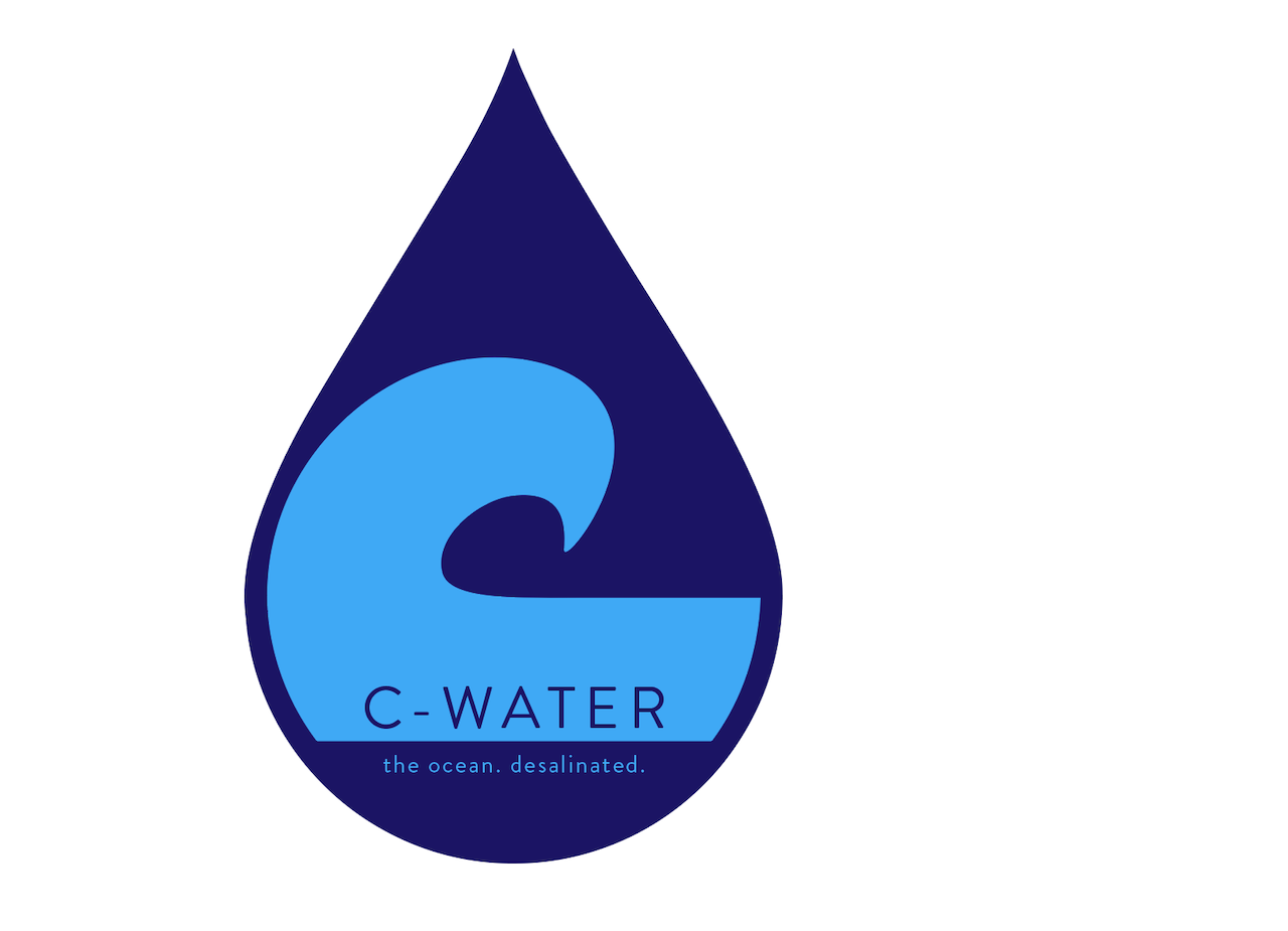
Alternative logos and other assets for digital use:
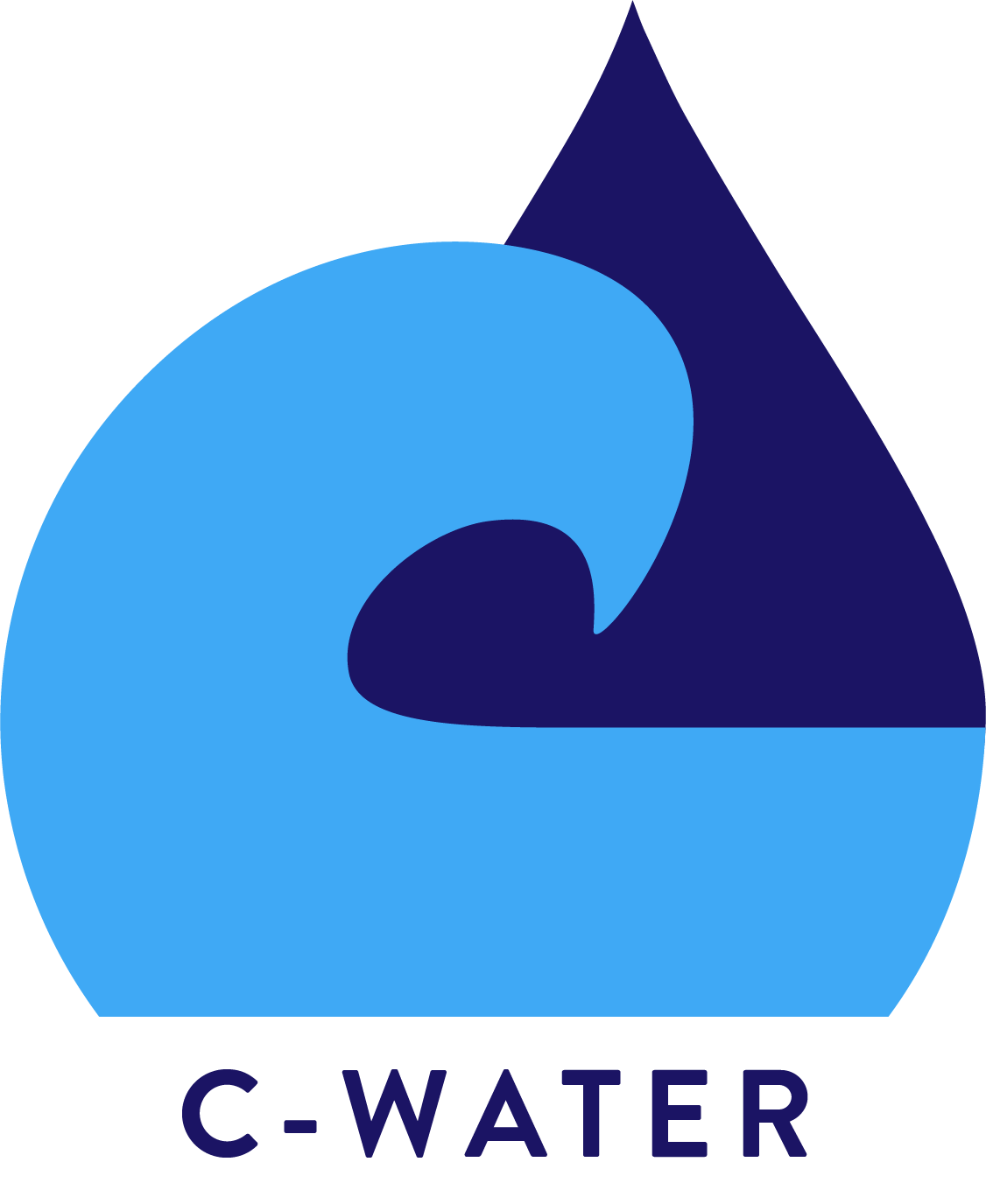
No slogan
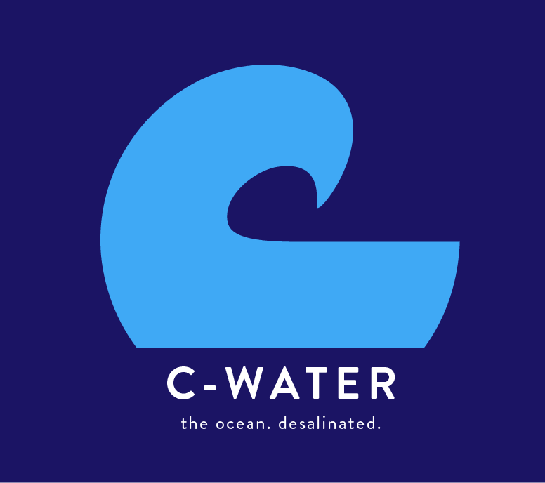
Alternative Logo for dark/dark blue backgrounds
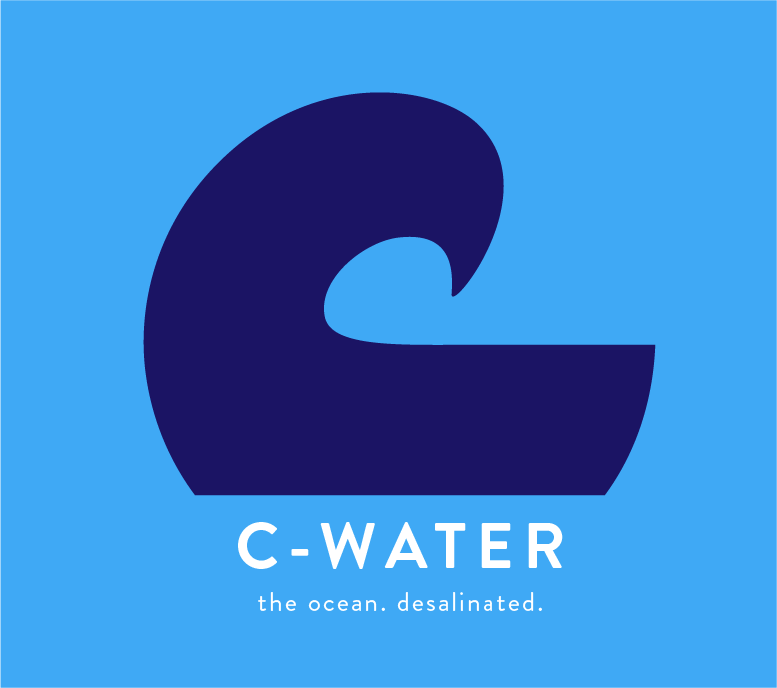
Alternative logo for light non-white/light blue backgrounds
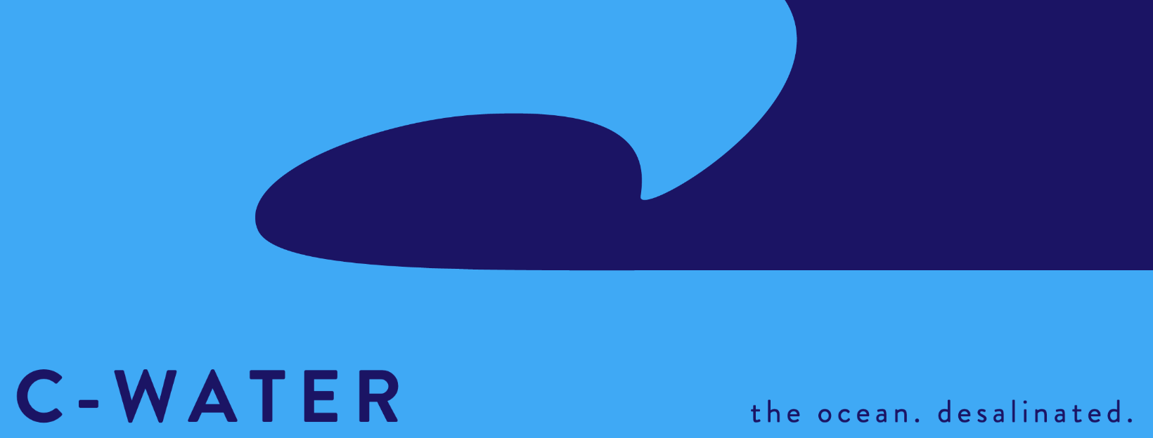
LinkedIn Banner with Brand Name